Branded QR Codes with Logos: Make Every Scan Feel On-Brand
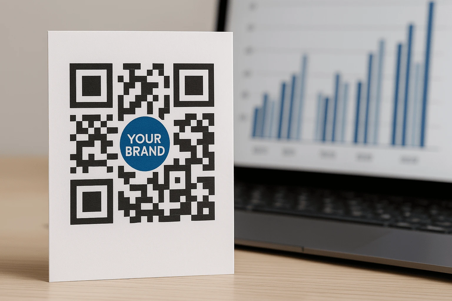
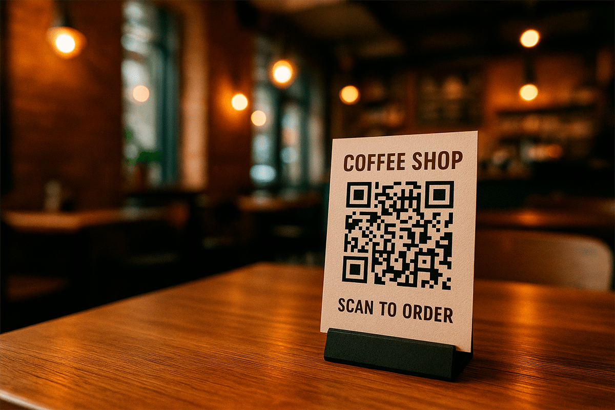
Picture a customer picking up your product, opening a menu, or glancing at a flyer or storefront. Their attention lands on a QR code. It is not the standard black square that looks like a last-minute utility. It uses your colors, sits naturally within the layout, carries your logo, and tells people exactly why they should scan. That is what turns an ordinary code into a branded QR experience.
A QR code is no longer just a technical shortcut to a link. It is another customer touchpoint, alongside your logo, color palette, typography, packaging, and social content. When it looks generic or out of place, it breaks the visual flow. When it reflects your identity, it becomes a useful, recognizable, and trust-building part of the brand.
This matters most in offline settings. People often have only a few seconds to notice the code, understand the value, and decide whether to scan. They assess the context and familiar visual cues before taking action. If a QR code blends into the background, offers no reason to scan, or feels untrustworthy, it is easy to ignore.
This guide explains what separates a branded QR code from a standard one, how to customize logos, colors, frames, and dot styles, where these codes work best, and how to protect scanability while improving the design. You will also see how to build one in the FbFast QR code generator without design or technical expertise.
The goal is not to create one more code. It is to create a QR code that looks professional, stays memorable, and reinforces your brand wherever customers encounter it: on packaging, in a post, on a storefront, in a presentation, or across an ad campaign.
If generic black squares no longer fit your visual language, a branded design is the practical next step.
What Is a Branded QR Code, and How Is It Different?
Technically, a branded QR code works exactly like a standard one. It can contain a link, contact details, Wi-Fi credentials, text, a map, a file, or another data type. The difference is not in how the data is encoded, but in how the code looks and feels before anyone scans it.
A branded QR code is styled to match a company or campaign. You can place a logo in the center, apply brand colors, change the dot and corner-marker shapes, add a gradient or background, and surround the code with a short CTA such as “Scan to learn more.” Together, these details signal that the code is intentional, belongs to a trusted brand, and leads somewhere relevant.
Branding is independent of the QR code type. You can customize both static and dynamic QR codes. Dynamic codes let you update destinations and track analytics, but either type can carry your visual identity. What makes the code branded is the experience it creates before the scan, not whether its destination can change later.
The Core Difference Between Standard and Branded QR Codes
A standard QR code is usually a black square on a white background. It is universal, reliable, and does its basic job well. But it says almost nothing about the company behind it and often looks like a technical element dropped into the layout at the last minute.
A branded QR code becomes part of the visual message. A familiar logo, recognizable palette, purposeful frame, and clear copy make its origin easier to understand. The code still leads to a destination, but it also supports trust along the way.
A Real-World Example
Imagine a natural skincare brand. A bottle carries a QR code with the logo in the center, a soft green-and-cream gradient, and a frame that says, “Scan to see how it is made.” Scanning opens a page with a production video, certifications, and a clear ingredient breakdown.
Now picture the same bottle with an unlabeled black-and-white code that has no visual connection to the packaging. Both codes may open the same page, but they do not create the same impression. One feels considered and relevant; the other feels purely functional.
That is the value of a personalized design. It does not replace the QR code’s function. It makes that function easier to notice, understand, and connect with your brand.
Why Businesses Use Branded QR Codes
People encounter a constant stream of messages, packaging, banners, and promotions, making attention a limited resource. A QR code may occupy only a small part of the layout, yet it can determine whether someone takes the next step. To do that, it needs to feel relevant, understandable, and trustworthy rather than simply being present.
A branded QR code offers more than visual polish. It attracts attention, communicates the benefit of scanning, reinforces trust, and makes the transition feel natural. It is functional design working alongside the message, layout, and offer.
It Captures Attention at the Right Moment
A standard QR code often fades into the background as a technical detail. A branded code has a better chance of stopping the eye because its color, shape, frame, or caption gives it a clear visual role.
At a trade show booth, cafe window, or event poster, people process several visual signals at once. A framed, high-contrast QR code labeled “Claim your bonus” or “View the menu” gives them a clear next step. There is no need to guess why the code is there.
It Can Encourage More Scans
People are more likely to engage with codes that look clear, relevant, and connected to the brand. Results also depend on size, placement, lighting, CTA copy, and the value waiting after the scan. Still, design is often the first filter: someone either notices the code and understands the benefit, or walks past it.
This is especially useful with dynamic QR codes, where you can customize the design and analyze performance after launch. Our guide to dynamic QR code analytics covers measurement in more detail. Design then becomes part of the experiment: test different CTAs, colors, and placements to see what performs best.
It Builds Trust Before the Click
QR codes often lead to pages where people must take action: share contact details, book an appointment, pay, open a menu, download a file, or join a channel. Before doing so, they assess whether the code appears safe.
A recognizable logo, familiar colors, and a caption explaining the outcome make the experience more predictable. They cannot guarantee action, but they can remove unnecessary doubt. That matters offline, where the destination URL is not visible until the code is scanned.
It Becomes a Memorable Part of Your Identity
Visual details help brands stay recognizable. When a QR code shares the colors, mood, and graphic logic of your other materials, it becomes another expression of your identity. People may forget a URL, but they can recognize the style the next time they see it.
Dot shapes, gradients, frames, corner markers, and logos all act as small brand cues. They should not overpower the message, but they can make the code feel recognizable and at home in the wider design.
It Completes the Layout Instead of Disrupting It
One practical advantage of a branded QR code is that it does not look out of place. Packaging, a flyer, a presentation, a menu, or a banner may have a carefully developed style, only for a generic black code to interrupt the composition.
When the code follows the same visual logic, it feels intentional. It becomes a finishing element that guides the viewer forward, not something added at the last minute.
A branded QR code is not decoration for its own sake. It makes each interaction with the brand clearer, more trustworthy, and more consistent.
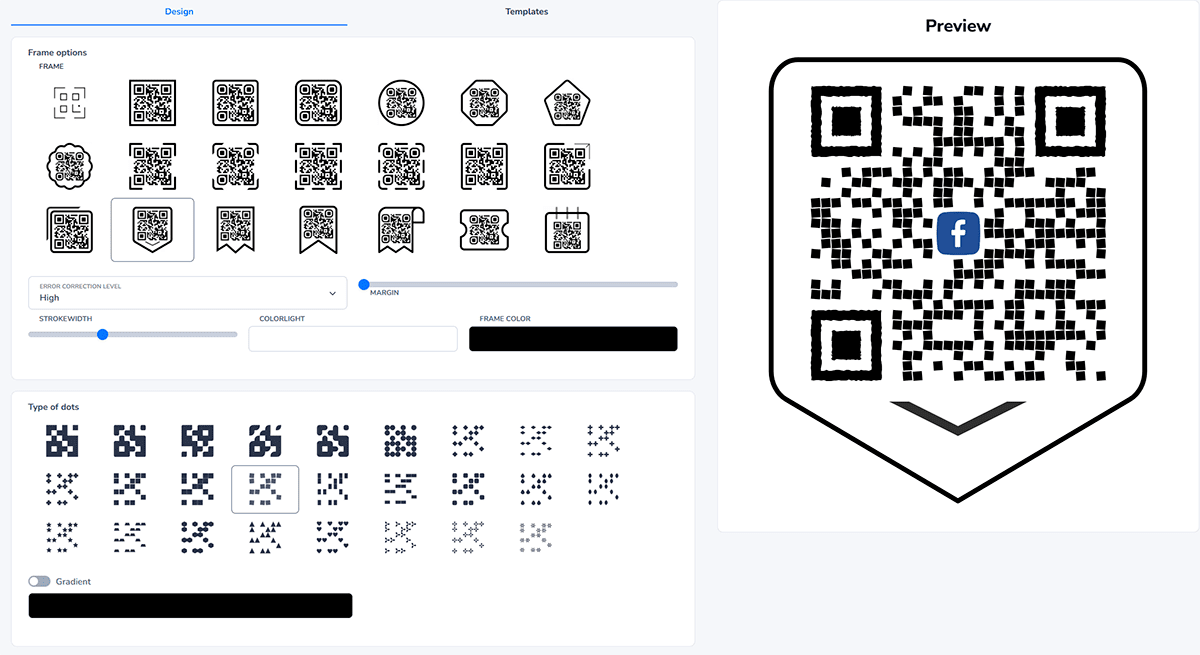
Which QR Code Design Elements Can You Customize in FbFast?
Flexibility is one of the biggest advantages of a branded QR code. The FbFast QR code generator lets you tailor the code to your brand, campaign, placement, print layout, or digital content.
No design expertise is required. The editor previews every change as you make it. The following elements shape not only the appearance of the QR code, but also how people perceive it.
A Logo in the Center
A centered logo provides an immediate recognition cue. It tells people who the code belongs to and shows that the QR is connected to a specific company or offer rather than an unknown third party.
FbFast lets you upload your own PNG or SVG or choose an icon from the gallery. Logos with transparent backgrounds, clean outlines, and moderate dimensions work best. An oversized logo can cover important areas, so leave enough of the code visible for reliable scanning.
Colors, Gradients, and Transparent Backgrounds
Instead of the standard black-and-white look, you can use your brand palette, a subtle gradient, or a transparent background. This helps the code blend naturally into packaging, posters, stories, banners, menus, and presentations.
Color must support readability as well as style. A camera needs to distinguish the code clearly from its background. A dark code on a light surface remains the safest choice, though other high-contrast combinations can work well. With a transparent background, always test the code against the final layout.
A common mistake is creating a beautiful but overly pale QR code that struggles in real conditions. Design should strengthen the function, never replace it.
Dot Shapes and the Overall Visual Character
Dot shape may seem like a small detail, but it changes the entire feel of a QR code. Circles, drops, diamonds, waves, and other styles can replace the standard squares. This lets you express the brand personality even at the smallest scale.
Crisp angles and geometric forms may suit a technology company, while softer, rounded elements may fit a cafe, skincare brand, or children’s product. Like typography, dot shape may not stand out on its own, but it influences the overall impression.
QR Code Corner Markers
The three corner markers help cameras recognize the QR code structure. In FbFast, you can style them separately from the main dots by changing their inner and outer shapes or making them sharper, softer, or more prominent.
This adds character while preserving a clear scanning structure. For small print applications such as business cards, stickers, or labels, choose shapes that remain easy to recognize.
A Frame with a Short CTA
A text frame is one of the most valuable elements for offline placements. Short prompts such as “Scan for a discount,” “View the menu,” “Leave a review,” or “Visit our website” tell people what to expect.
The caption acts as a simple instruction and answers the key question: why should I scan this? Without context, even a well-designed code can be overlooked. With a concise CTA, it becomes a clear invitation to act.
Download Formats
Once the design is ready, save it as PNG for websites and social media, SVG for lossless design work, or PDF for print. The finished file can go straight to a designer, into a layout, or onto a webpage.
If you work with an agency or prepare materials for a print shop, SVG helps prevent pixelation. You can scale the code and place it in Figma, Adobe Illustrator, Canva, or other tools without losing clarity.
Your QR code remains available in your account, so you can revisit it, adjust the design, test another CTA, or update its settings. FbFast supports both one-time use cases and dynamic QR codes that can be edited after publication.
Where to Use Branded QR Codes: Practical Examples
There is no single ideal placement for a branded QR code. It can support any physical or digital customer touchpoint: a product, storefront, social post, advertising banner, presentation, or cafe table. What matters is giving the code a clear purpose and designing it for the surrounding context.
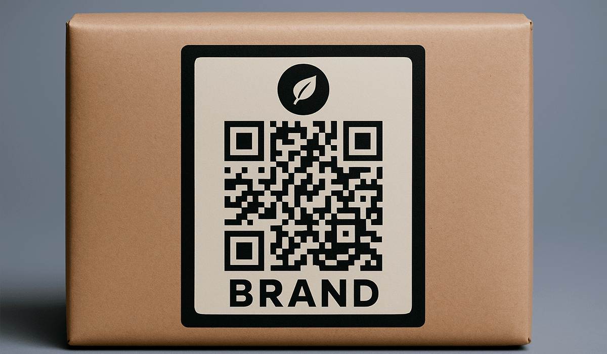
QR Codes on Product Packaging
Imagine a skincare brand adding a QR code to a product box. Instead of a generic square, the code has a clean frame, a subtle gradient, and the company logo. A caption sets the expectation: “Scan to see how this product is made.”
The scan opens a page with a video, ingredient list, certifications, instructions, or reviews. Customers gain transparency, while the brand gets another opportunity to communicate value before the first use.
In this setting, the code should not look pasted over the packaging. Matching the palette, choosing the right size, and respecting the composition make it part of the visual conversation with the buyer.
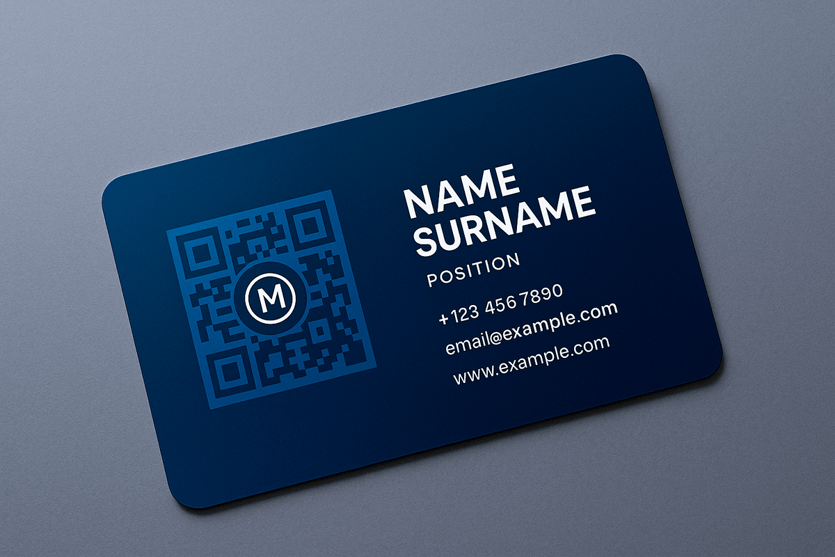
QR Codes on Business Cards
QR codes are now common on business cards, but their design still shapes the impression. A technical-looking code disconnected from the card can disrupt the layout. One styled for the company or professional strengthens the presentation.
For example, a consultant or IT specialist might add a logo, a dark blue gradient, and a “Save contact” caption. The code opens a digital business card or contact page, letting the recipient save the details without typing them manually.
This is more than convenient. It shows attention to detail and creates a professional impression before the conversation even begins.
QR Codes on Flyers, Banners, and Posters
In advertising materials, QR codes compete for limited attention. Someone may be walking past, waiting in line, or looking at a poster for only a few seconds. The code must be large enough to scan and immediately clear in purpose.
An event poster, for example, can feature a campaign-colored QR code labeled “Get tickets online.” A visible frame directs people to the registration page. The code becomes a direct path from interest to action rather than a minor technical detail.
These codes work well in shopping centers, movie theaters, office spaces, display stands, and outdoor advertising. Place them where people have enough time to scan, such as entrances, waiting areas, checkout counters, or eye-level displays.
QR Codes for Social Media
On TikTok, Instagram, Facebook, or LinkedIn, QR codes can appear in content as well as profiles. Use them in stories, banners, presentation graphics, giveaways, offline announcements, and campaigns leading to Telegram, a website, or a landing page.
A coffee brand might publish a story featuring a QR code styled like its product label. The code opens a Telegram channel with promotions or an ordering page. When the design matches the story, the code feels like part of the creative rather than an accidental insert.
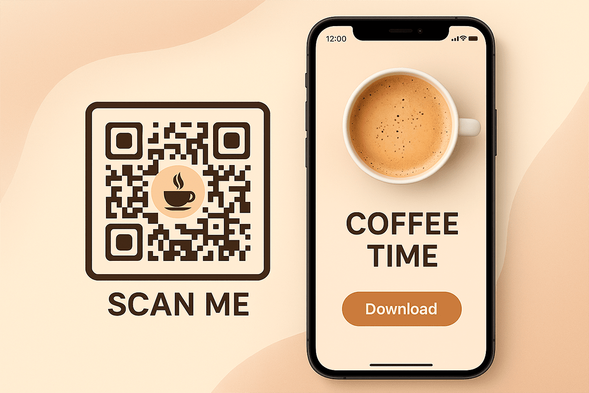
Visual harmony matters especially on social media. A custom QR code can fit naturally into a story, banner, or post without looking overly technical. Keep strong contrast and make the code large enough to scan from another screen.
QR Codes in Physical Spaces: Windows, Tables, and Interiors
In a store, salon, cafe, or barbershop, a branded QR code can act as a quiet assistant. It guides customers when staff are busy, a line is forming, or someone simply wants information without waiting.
A barbershop might place a logo-branded QR code on a mirror with a dark gradient and the prompt “Book in 30 seconds.” Customers scan it, open a bot or booking form, and choose a barber and time without downloading an app, calling, or waiting.
Cafes can use the same approach for menus, reviews, or loyalty programs. A table card might say “Rate your coffee” or “Open the menu.” The experience feels natural when the code matches the interior and does not overwhelm the space.
Across all these scenarios, the branded QR code avoids looking like a technical interruption. It helps customers take the next step while supporting the brand’s visual style.
How to Design a QR Code That Scans Reliably
A QR code needs to do more than look good. It must scan quickly, communicate clearly, and feel trustworthy. Even an excellent visual design fails if a camera cannot recognize it or people do not understand what will happen after scanning.
Keep these practical design principles in mind before placing a QR code on packaging, an ad layout, signage, or digital creative.
Contrast Matters More Than Decoration
A smartphone camera reads patterns, not aesthetics. Insufficient contrast between the code and its background can slow down scanning or prevent it entirely. A dark QR code on a light background remains the most dependable option.
Gradients can work as long as they do not make the code too pale. Transparent backgrounds are also possible when the surface underneath is clean and even. Placing the code over a photo or a detailed wood, concrete, fabric, or coffee-bean texture can make the pattern harder for cameras to distinguish.
Start with the real viewing conditions, then choose decorative effects. The same QR code can behave differently on a screen, glossy packaging, paper, or a storefront window.
Keep the Logo from Covering Scannable Areas
A centered logo makes a QR code recognizable, but its size needs careful control. An oversized mark or complex background can cover important parts of the structure.
Use a PNG or SVG with a transparent background and keep the logo at a moderate size. The center of the code should serve as a recognition cue, not become a full graphic banner.
FbFast shows the result as soon as you add the logo. Even so, test the final version on a smartphone before printing or launching the campaign.
A Short CTA Explains Why People Should Scan
Not everyone will scan a QR code without an explanation. One short line can make the action clear: “Scan for a discount,” “Open the menu,” “Leave a review,” “Book online,” or “View instructions.”
This copy is particularly effective on flyers, packaging, storefronts, banners, and table displays. It answers the viewer’s question before they need to ask it. Digital content may provide enough surrounding context, but offline placements often depend on a caption beside the code.
Keep the CTA concise. A short, specific phrase describing the outcome works best inside a QR frame.
Balance Brand Colors with Readability
Visual consistency matters. A QR code styled with the same palette as the website, logo, or packaging feels natural. But exact color matching is not worth sacrificing contrast.
If your primary brand color is very light, use it in the background, frame, or accents and choose a darker shade for the code itself. A light beige palette, for example, can pair well with a dark brown code on a pale background. The style remains consistent without compromising function.
Test Real Scanning Conditions Before Launch
After finishing the design, test the QR code under the conditions your audience will encounter. Scan it with iPhone and Android devices, from different distances and angles, in daylight and artificial light. If it will be printed, make a test print instead of reviewing only the file on-screen.
Testing matters especially for glossy surfaces, small labels, signs behind glass, and textured materials. A design that looks perfect in the editor may behave differently in the real world.
A few minutes of testing can prevent an expensive print run that some customers cannot scan.
How to Create a Branded QR Code in FbFast
Generating a QR code is quick. Making it feel like part of your brand takes a little more thought about the design. That is where a basic generated code becomes a branded customer touchpoint.
FbFast does not require coding, Figma, or a designer for the essentials. Create the QR code, open the design settings, and gradually adapt it to your visual identity. These steps help you produce more than an attractive file: they create a practical communication tool.
1. Define the Action the QR Code Should Drive
Every QR code needs a specific purpose. It might lead to a website, Telegram, digital business card, booking page, PDF, menu, map, feedback form, or payment page. Choose the code type in the generator, and the interface will show you which fields to complete.
The clearer the intended action, the easier it is to write the CTA, choose the design, and decide on placement. A beautiful QR code with no clear purpose will still underperform.
2. Open the Design Settings
The editor shows every change in real time. Customize the color, background, logo, dot shape, corner markers, and frame. The live preview makes it easy to judge whether the code fits your brand.
Keep your brand palette or the final layout nearby during this step. It will help you stay consistent without losing contrast.
3. Add a Logo or Icon
A centered logo is an instant recognition cue. It helps people understand that the code belongs to your brand. Upload an SVG or transparent PNG so the mark stays clean and does not introduce an unnecessary background block.
Avoid making the logo too large. Its role is to confirm the code’s origin, not cover its structure. If the code will be printed, test the finished version on a real device.
4. Choose Colors with Scanability in Mind
FbFast lets you choose a single color, create a gradient, or use a transparent background. That creates plenty of room for styling, but the QR code should never become a purely decorative illustration.
The code color must remain clearly distinct from the background. Check whether your brand colors provide enough contrast. If they do not, use a darker shade for the code and reserve the primary brand color for the frame, caption, or surrounding layout.
5. Customize the Dots and Corner Markers
Standard squares are only the starting point. Choose circles, drops, diamonds, bubbles, waves, or other shapes to give the code the right character. Geometric forms can suit a precise technology brand, while softer elements may work better for a lifestyle product.
Corner markers can be styled separately as well. This makes the code more distinctive without changing its purpose. Keep the forms simple enough for fast recognition.
6. Add Text to the Frame
A short phrase around the QR code makes its purpose easier to understand. “Scan to learn more,” “Claim your bonus,” “Book in 30 seconds,” and “Open the menu” are not just captions; they explain the value of taking action.
In digital materials, the surrounding post or page often provides enough context. Offline, a framed CTA is usually helpful because people encounter the code away from your website and may not know what the scan will deliver.
7. Save and Test the Code
Download the finished QR code as PNG for social media and websites, SVG for design and print, or PDF for offline layouts and presentations. Before using it, test it on several devices under realistic conditions.
Scan from different distances and angles, from both screens and paper. Make a test print for packaging, check reflections for storefront displays, and confirm that a story-sized code is large enough to scan from another screen.
The result is more than a QR code. It is a new customer touchpoint that reinforces your identity and moves people toward the intended action without unnecessary explanation.
Conclusion: Make QR Codes Part of the Brand Experience
A QR code should no longer be treated as merely a technical way to open a link. For many businesses, it is now part of the customer experience across packaging, menus, business cards, advertising, social media, and physical locations.
A branded QR code makes that experience more consistent. It fits the design, explains the action, and supports trust. This small element can influence whether someone notices the offer, understands its value, and takes the next step.
If you need more than a generic code, FbFast provides the tools to make it part of your identity: logos, colors, shapes, frames, flexible editing, and practical download formats.
Start with one touchpoint where a QR code genuinely helps the customer, create an on-brand design, test the scan, and only then add it to print or a campaign. That approach turns a branded QR code from decoration into clear, useful communication.