Custom QR Code: How to Design with a Logo, Brand Colors, and Reliable Scanning
Why brands need custom QR codes
QR codes have become a routine business tool: they send people to websites, menus, catalogs, registration forms, payment pages, loyalty programs, and promotional offers. Their biggest advantage is speed - they move a customer from a physical touchpoint to a digital journey without forcing anyone to type a URL. But a default black-and-white code often looks like a purely technical insert that does not support the brand identity or explain why it is worth scanning.
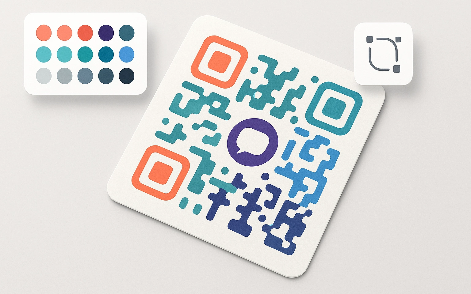
That is why a custom QR code has become an important part of modern brand communication. A logo, brand palette, clean frame, clear call to action, and thoughtful placement can turn a basic code into a recognizable design element. When a brand can create a unique QR code in its own style, the result does more than decorate a layout: it reduces hesitation, strengthens recognition, and makes the path to the intended content clearer.
At the same time, QR code design cannot be separated from technical requirements. Low contrast, a busy background, excessive decoration, or an oversized logo can make even a beautiful QR code hard to scan. Customization has to work in two directions at once: it should support the visual language of the brand while keeping the code reliable in real conditions - on screens, packaging, business cards, posters, labels, and other carriers.
In this guide, we look at how to create a custom QR code with a logo, colors, and a frame, how to choose the right palette, adjust the background, preserve the "quiet zone," and prepare the design for print. We also cover how to write a QR code CTA, why testing matters more than visual flair, and which common customization mistakes to avoid.
This article is useful for marketers, designers, business owners, and anyone who wants to create an attractive QR code for advertising, packaging, menus, events, or business cards. A well-designed custom QR code does not feel like a random addition to a layout. It works as a visible, understandable, and measurable touchpoint with the audience.
How a custom QR code builds brand trust
In digital and offline communication, trust often forms before the first click or scan. People evaluate not only the offer, but also how it is presented: whether the QR code destination is clear, whether it belongs to a familiar brand, and whether the material looks professional. A plain black-and-white code can do its job, but it rarely explains the context and almost never supports recognition.
A custom QR code changes that first impression. When the design includes a logo, brand colors, a neat frame, or a short CTA, users understand faster that the code is connected to your brand. This is especially important in situations where people are cautious about scanning: public spaces, stickers, print ads, packaging, or menus.

Why branded design influences the decision to scan
First, customization confirms brand ownership. A logo and corporate palette shorten the path from "what is this code?" to "this is an official company touchpoint." That effect is especially useful for restaurants, service businesses, events, stores, and local brands, where users often make a decision in just a few seconds.
The second advantage is visual separation. On printed materials, stands, or packaging, a QR code can easily disappear among other elements. A frame, contrast area, short call to action, and recognizable style make it noticeable without making the design loud. The user does not merely see the code; they understand its role in the specific scenario.
A custom QR code also raises the perceived quality of the experience. When a brand pays attention to details even in a small element like this, it signals professionalism and consistency. Still, the code should not become a decorative illustration. Trust grows only when polished design is paired with stable scanning and a clear result after the scan.
Practical example for business
Imagine a restaurant placing a QR code on a printed menu or table tent. A default code can look incidental, while a QR code with the restaurant logo, a brand-colored frame, and a CTA such as "View the menu" creates clear context. The guest understands that the scan leads to the official digital menu, not an unknown page. That lowers doubt and makes the interaction feel natural.
The same principle works for stores, educational events, service salons, coffee shops, exhibitions, and printed promotional materials. A custom QR code does more than decorate the layout: it explains the action, supports the brand, and helps the user take the next step faster.
The future of custom QR codes: trends and new opportunities
QR codes keep evolving together with digital interaction scenarios. They used to be treated mostly as a fast link, but today they increasingly serve as an entry point into richer communications: personalized offers, interactive campaigns, loyalty programs, AR experiences, analytics, and content that can be updated over time.
For brands, this means that creating a unique QR code is no longer limited to choosing a color or adding a logo. It is worth thinking more broadly: what experience begins after the scan, how the code looks on its carrier, whether it matches the brand tone of voice, whether the campaign can be measured, and whether the destination can be changed without reprinting materials.
Connecting QR codes with augmented and virtual reality
One of the strongest directions is combining custom QR codes with augmented and virtual reality. A scan can open a 3D product model, an interactive manual, an animated presentation, a virtual tour, or a branded story. In these scenarios, the QR code design should set the right expectation: it should show that the user is not opening a regular page, but entering a richer experience.

Interactive campaigns and gamification
Another direction is the use of custom QR codes in gamified campaigns. These can include city quests, multi-step promotions, points collection, event check-ins, or interactive stands. In such cases, the QR code becomes part of the story rather than just a technical link. Its design should support the overall mood of the campaign while remaining simple enough to scan quickly in motion.
Analytics and flexible campaign management
Dynamic QR codes open a separate layer of marketing opportunities. A team can track scan volume, traffic sources, geography, devices, and performance across different carriers. This helps marketers understand which layout, CTA, or channel works better and make decisions based on data instead of assumptions.
The ability to update the destination page without changing the code is especially valuable. For example, the same QR code on packaging can point to a seasonal offer, an instruction page, a registration form, or a new product page depending on the campaign stage. With this approach, QR code setup becomes part of the strategy rather than a one-time technical task.
New standards in custom QR code design
As cameras, mobile browsers, and design tools improve, brands get more room for customization. The core rules remain the same: contrast, a clean quiet zone, sufficient size, the right error correction level, and testing on real devices. The future of custom QR codes is not about maximum decoration. It is about the smart combination of visual identity, a useful user scenario, and technical reliability.
Companies that already work with stylish online QR codes in a systematic way gain an advantage: they create recognizable touchpoints, measure offline materials more effectively, and build a more consistent experience for their audience.
Creative approaches to custom QR code design
Modern customization can make a QR code part of the brand identity instead of a random black-and-white insert. A strong design, however, starts not with decoration, but with the task: where the code will appear, how far away it will be scanned from, which device the audience is likely to use, and what the user will receive after the scan.
Patterns, textures, and background ornaments can give a QR code character, but they should be used carefully. If the background is too active or resembles QR modules, the scanner may treat it as part of the code structure. Light, low-contrast elements usually work best when they stay outside the quiet zone and do not reduce the difference between modules and background.
Module shape can also support the brand style. Instead of standard squares, designers sometimes use rounded modules, softer corners, or stylized dots. This can make the code feel more approachable, but it requires restraint. If the shape becomes too complex, especially at small sizes, scan stability can suffer.
Transparent or semi-transparent areas can be useful when a QR code needs to fit naturally into a label, poster, package, or another design layout. But transparency must not weaken key elements: position markers, data modules, and the quiet zone. In practical design, it is usually better to place a calm base under the code than to try to dissolve it into a busy background.
Artistic integration works best in campaigns where the QR code is part of a larger composition: an illustration, poster, ad series, or branded package. In that case, the code can interact with the graphics, but it should not lose its main role. Users need to quickly recognize that it is a QR code, understand the action, and scan it without effort.
How to preserve readability in creative design
No matter how creative the concept is, function remains the main quality criterion. For custom QR codes, it is important to maintain strong contrast between modules and background, avoid covering position markers, keep enough quiet zone, and choose the error correction level according to the design complexity. If a logo or decorative elements are added, ECC Quartile or High is often appropriate, but even a high ECC level cannot compensate for critically poor contrast or overly small print.
After every meaningful customization step, test the code on different devices and in different lighting conditions. The final layout should also be tested after export and after printing, because paper, film, cardboard, or a glossy surface can make the QR code behave differently than it does on screen.
Creative personalization of branded QR codes works best when the design supports the function instead of competing with it. A successful result looks recognizable, fits the carrier, and scans reliably without extra explanation.
Color theory for QR codes: choosing a palette that works
Color is one of the most visible elements of personalization, but for QR codes it has both aesthetic and technical value. When you create a branded QR code for business, it is not enough to apply the corporate palette. You also need to check whether the modules and background remain clearly separated.
Contrast as the foundation of successful design
Scanners rely primarily on brightness difference. That is why the most reliable option is still a dark QR code on a light background: black, navy, graphite, dark green, or another deep module color on white or a very light surface. This approach works well both on screen and in print.
A light code on a dark background can look striking, but it does not always scan with the same stability across devices. If the brand book requires an inverted design, test it on different smartphone models, in low light, with glare, and from different distances. For printed materials, check the final printed result as well, not just the digital mockup.
How to integrate corporate colors into a QR code
If a brand has a dark primary color, it can often be used for the QR code modules. Navy, burgundy, saturated green, or graphite can preserve recognition without compromising readability. Light brand colors - beige, milk, pale blue, soft yellow - usually work better as a background or base, as long as they do not reduce contrast.
Gradients can work, but only when the modules remain dark enough against the background in every part of the code. The biggest risk appears where a gradient shifts into a shade that is too light or too close to the background. In those areas, some modules may lose definition and scanning can become unstable.
Color psychology without hurting scanability
Color can support the brand message. Blue often suggests reliability and professionalism, green can signal nature, safety, or sustainability, red adds energy and urgency, and yellow suggests optimism and attention. But for a QR code, color psychology should come second to functionality. If the "right" brand color reads poorly on the selected background, it is better to use it in the frame, CTA, or caption and keep the code itself more contrast-friendly.
Common mistakes when adjusting QR code color
The most common mistake is insufficient contrast. Pastel modules on a light background, shades that are too similar in tone, or highly decorative gradients can look neat while still being hard for the camera to recognize. Acid colors, saturated reds, and complex multicolor schemes also need caution, especially when the QR code is intended for print or small formats.
High-quality QR code color setup is always a compromise between the brand book, the carrier design, and real scanning conditions. Before launch, test the code on several devices, under different lighting, and, for print projects, on the actual material.
QR code frames and CTAs: creating visual hierarchy
A custom QR code is not made only of modules, a logo, and colors. Very often, the frame and a short call to action (CTA) determine whether the user notices the code and understands why it is worth scanning. Without context, even a well-designed QR code can be overlooked, especially in a visually dense layout.
The role of a frame in a custom QR code
A frame separates the code from the rest of the design and creates a visual focal point. This is useful on posters, packaging, menus, business cards, and promotional materials where the surrounding area contains a lot of text, images, or decorative elements. It can also support the brand palette, for example by repeating the primary brand color or highlighting the campaign accent shade.
At the same time, the frame must not intrude into the quiet zone around the QR code. The clean perimeter helps the scanner recognize the code boundaries correctly. If the frame sits too close to the modules or blends with them in color, it can make scanning harder instead of easier.
How to write an effective CTA
A QR code CTA should tell users exactly what will happen after scanning. A phrase like "Scan" is often not enough because it does not communicate value. Clear CTAs such as "View the menu," "Get the discount," "Register for the event," "Open the catalog," or "Download the guide" set expectations immediately.
The CTA is usually best placed directly above or below the code, and sometimes inside the frame if it does not disturb the quiet zone. The text should be short, readable, and high-contrast. On small carriers, avoid shrinking the font too far. The user should understand the action before bringing the phone closer.
Visual hierarchy: from message to scan
Good hierarchy guides the user's eye naturally: first they see a short message or benefit, then the QR code, then they scan. The frame, contrast base, logo, and CTA should work together instead of competing with one another. If every element is equally loud, it becomes harder for the user to understand the primary action.
Careful QR code setup through frame and CTA improves not only the visual quality, but also practical performance. A custom QR code becomes part of the scenario: it attracts attention, explains the value, and shortens the path from an offline touchpoint to the right page.
Designing QR codes for small formats: business cards and labels
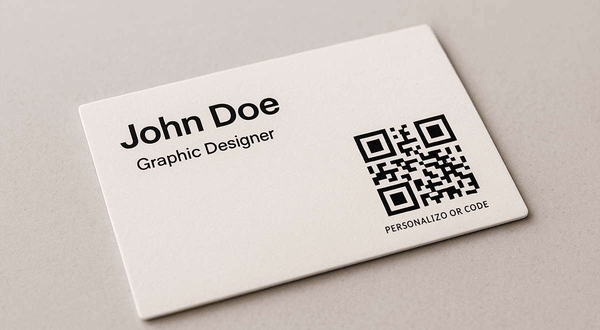
Using a custom QR code on business cards, labels, small stickers, or tags requires particular precision. In a small format, every mistake becomes more visible: modules are smaller, the logo takes up a larger share of the area, and print quality has a stronger impact on scanning. That is why the design should stay clean and the real scanning distance should be considered from the start.
The main challenge: stable scanning at compact size
For close-range scanning, a QR code of roughly 2 x 2 cm, not counting the quiet zone, is often treated as a starting point, but the final size depends on data density, print quality, and use case. The longer the URL or the more complex the content, the more modules need to be encoded, which makes each module smaller. For printed materials, short links or dynamic QR codes are often preferable when they fit the campaign goal.
Design principles for business cards, labels, and stickers
Compact carriers work best with simple module shapes, strong contrast, and very limited decoration. Classic squares or softly rounded modules are usually safer than complex artistic patterns. Dark modules on a light background remain the most reliable choice, especially when the code is printed on textured paper, cardboard, film, or a label.
A logo inside a small-format QR code should be very simple. If the mark contains small details or thin lines, use a simplified version or place the logo next to the code instead of inside it. In many cases, it is safer to keep the QR code cleaner and express the branding through the frame, base color, CTA, or overall business card layout.
Complex gradients, transparent areas, and deep integration into images are better avoided on small carriers. What looks strong on a large poster can lose readability on a label. The quiet zone should also remain at least several modules wide around the code, even when the layout feels tight.
What to consider before printing
When designing a branded QR code for a business card or label, consider not only the layout, but also the material. Textured, glossy, or dark paper can create glare, reduce contrast, and hurt readability. If the print run includes lamination, foil, or varnish, the QR code should be tested in that exact final finish.
Before launching the full print run, print a test sample and check it with several smartphones. Testing should happen not only in ideal lighting, but also in the conditions where the carrier will actually be used: a cafe, store, exhibition, checkout area, shelf, or outdoor light.
Final testing as a required step
Creating a beautiful and effective QR code for a label or business card is impossible without practical testing. Check the code on different smartphones, from different distances, and at different angles. This helps catch problems before the main print run, when fixing them can become much more expensive.
In small formats, the design should be restrained, clean, and technically precise. With the right approach, even a small custom QR code can work as an effective channel to a website, catalog, contact details, menu, or special offer.
How negative space and backgrounds affect QR code readability
When creating a custom QR code, teams often focus on the logo, colors, and module shape, but negative space often decides whether the code will scan consistently. Even the strongest design can lose effectiveness if there is no clean area around the code or if the background creates visual noise.
What negative space means in QR code design
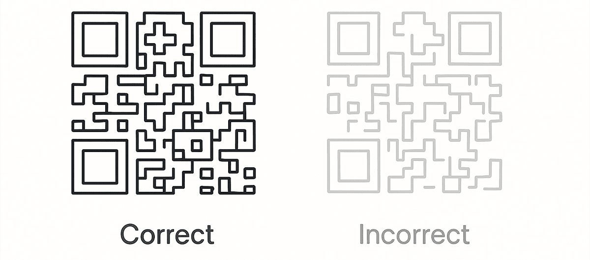
Negative space is the open area that helps the scanner separate the QR code from its surroundings. It includes the space between modules, the internal areas of position markers, the background under the code, and, most importantly, the quiet zone around the perimeter. The quiet zone should stay clean: no text, frames, illustrations, patterns, or decorative elements that could be read as part of the code.
A standard approach keeps at least 4 modules of clear space around the QR code. In print, it is sometimes worth giving the code even more breathing room, especially when it sits next to bright graphics or small text. This makes scanning faster and reduces the risk of errors.
How background and visual noise affect scanability
A complex background can interfere with recognition of the QR code structure. Small dots, grids, textures, high-contrast illustrations, or patterns can imitate modules, making it harder for the camera to identify the boundaries and data blocks. Backgrounds with QR-like geometry or color areas close to the module color are especially risky.
Backgrounds can also reduce contrast. If the base is not uniform, some modules will read better than others. On screen this may look minor, but during motion scanning, in weak lighting, or after printing, that unevenness can become critical.
Best practices for backgrounds and quiet zones
The safest approach is to use a solid light background or a very calm base with minimal texture. If the brand visual style requires a more complex background, add a separate light area or card under the QR code to separate it from the broader composition. This keeps the layout design intact without sacrificing scanability.
Avoid placing small decorative elements next to the QR code if they enter the quiet zone. A frame also needs to be handled carefully: it can emphasize the code, but it should not touch the modules or blend into them. A high ECC level can compensate for some damage or minor defects, but it does not replace the basics: clean background, strong contrast, and enough space.
Testing before launch
After creating a designer QR code with a non-standard background, always test it in real conditions: on different smartphones, under different lighting, from different distances, and after final export. If the code will be printed, test the printed sample instead of relying only on the on-screen mockup.
Proper control of negative space and background helps even a highly creative custom QR code remain a reliable communication tool. The design can be expressive, but it must still leave the scanner enough "air" for fast and accurate recognition.
Final recommendations for an effective custom QR code
Creating a custom QR code requires balance between aesthetics, technical reliability, and a clear user scenario. Every design decision should answer a simple question: does it help people notice the code faster, understand the value of scanning, and reach the right content without friction?
Start not with color or logo, but with the target action. A QR code can lead to a menu, booking form, promotion page, catalog, instruction, contact card, or landing page. This choice affects the CTA, code size, carrier type, and analytics needs. The clearer the scenario, the easier it is to create a design that does more than look good - it works.
Logo integration, module shape changes, and the corporate palette should strengthen the brand without weakening contrast. If there is any doubt, make the code simpler and express the brand through the frame, caption, CTA, or surrounding design. In most real campaigns, stable scanning matters more than a complex decorative effect.
Pay special attention to the carrier. Large posters can support a more expressive composition, while business cards, labels, and stickers are better served by a clean structure, sufficient module size, and minimal fine detail. A printed QR code should always be checked after printing, because material, ink, lamination, glare, and texture can change how it behaves.
Thorough testing on different devices and in different lighting conditions should be mandatory before launch. Check not only whether the code scans, but also how quickly it is recognized, whether the link is correct, whether the page loads, and whether the result matches the expectation created by the CTA. The user should get exactly what the text next to the code promised.
A successful custom QR code is not just a nice design detail. It is a compact brand communication tool that connects an offline carrier with a digital action, increases trust, makes interaction clearer, and helps the business measure results. Start with a simple, high-contrast, well-tested solution, then add creative elements only when they genuinely improve the user experience.