11 Common QR Code Mistakes — and How to Avoid Them
Article Contents
- 1. QR code with no explanation
- 2. Poor contrast or a blurry code
- 3. Long or unreadable links
- 4. A logo covering key elements
- 5. Static code instead of dynamic code
- 6. No scan analytics
- 7. Poor placement
- 8. An unavailable or outdated page
- 9. Links without HTTPS
- 10. Design that gets in the way
- 11. A code that does not lead where it promised
QR codes have become so ordinary that we often notice them only when they fail. A cafe menu, an event flyer, a product label, a bus-stop poster, a sticker near checkout — one small square can move someone straight to a page, form, coupon, or instruction. But when a QR code does not scan or sends people to the wrong place, it is no longer a small technical detail. It means lost visits, broken interaction, and less trust.
The most common QR code mistakes rarely come from the technology being complicated. They usually come from details that feel secondary until the campaign goes live. Weak contrast, and the camera cannot read the code. No caption, and the user has no reason to scan. A link to a missing or outdated page, and a potential customer becomes a frustrated visitor.
This article breaks down the QR mistakes that appear most often in print, offline advertising, packaging, menus, presentation materials, and digital campaigns. The point is not only to know what can go wrong. It is to understand how to prevent these problems before the QR code reaches print or becomes part of a marketing layout.
If you plan to create a QR code for a website, campaign, or business page, do not stop at generating the image. Check the context, design, URL, mobile page, analytics, and user expectation. At the end of this article, you will find a practical checklist for reviewing the critical points before publishing or printing.
Below are 11 mistakes that most often stop QR codes from working well, with clear ways to avoid each one without making the process more complicated than it needs to be.
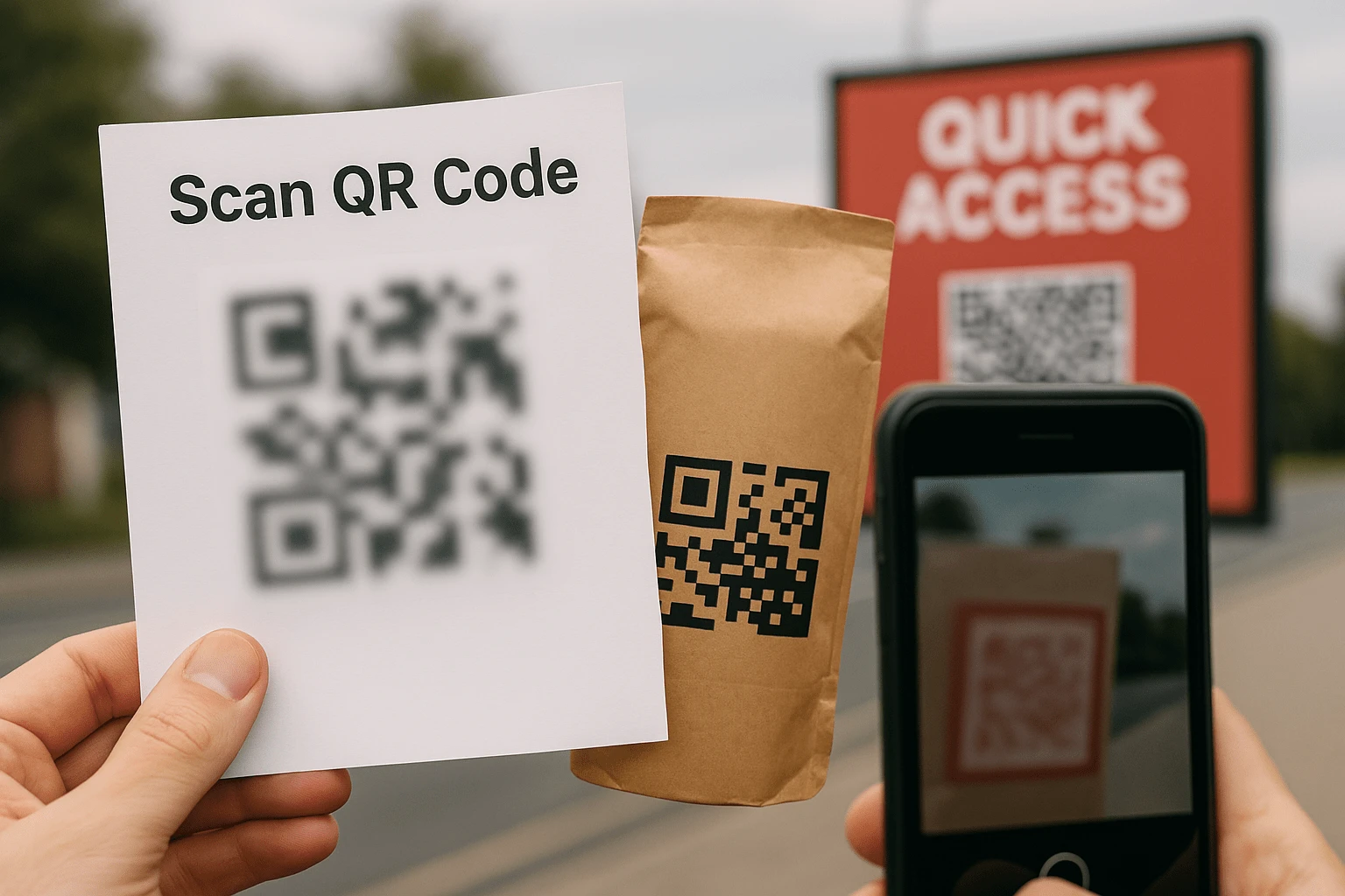
Mistake #1: A QR Code Without User Context
Picture the situation. You are standing at an exhibition booth or holding a flyer. There is a large QR code, but nothing next to it. No caption, no instruction, no short explanation of where it leads or what happens after the scan. The user sees a technical symbol, but not a reason to act.
This lack of context is exactly why people often ignore QR codes. Not because they do not know how to use them, but because they do not want to step into the unknown. That is especially true when a mobile browser, a smartphone camera, personal data, or an unfamiliar website is involved.
A QR code is a bridge between a physical touchpoint and a digital action. But that bridge works only when the destination is clear. If people cannot see the benefit or the outcome, they will not spend time scanning, even if the code itself is technically perfect.
💡 Tip: always add a short, specific call to action. For example: “Scan to view the menu”, “Get 10% off”, “See promotion details”, or “Open the setup guide”.
That small line does not overload the layout, but it removes the user's main question: why should I scan this? In QR code marketing case studies, clear context often affects results just as much as the visual design of the code.
It works even better when the caption sounds like your brand. For example: “Scan and claim your gift from FbFast 🎁”. The phrase explains the action and creates an expectation. The user understands what they will get after scanning and sees the QR code as a useful part of the message, not a random square on the layout.
If you are creating your own code, do not leave the explanation for later. You can think it through while working in the QR code generator. One short line beside the code often decides whether the scan happens at all.
Mistake #2: Poor Contrast or a Blurry QR Code
This is one of those mistakes that looks harmless until the print run is already done. A background that is too light, colors that blend together, a QR code placed over wood texture, craft paper, a photo, or a complex gradient. On screen the design may look interesting, but a smartphone camera does not judge style; it needs a clear pattern it can recognize.
A QR code is a machine-readable object. The camera does not guess where a module ends and the background begins. It either sees enough contrast, or it does not. Anything that reduces the difference between dark and light areas increases the risk of a failed scan. Even a beautiful design can fail if the code visually melts into the surface.
Example: a restaurant printed a QR code on textured craft paper. It matched the brand visually, but guests had to light the menu with their phones and find the right angle to focus. Some of them simply asked for a paper menu.
The safest approach is still a dark code on a light background. Black and white works almost every time, but that does not mean the design has to be plain. Brand colors, logos, frames, and QR styling can work well as long as they do not harm the main job: fast, stable scanning.
For print, people often recommend a minimum size of about 2.5 × 2.5 cm, but that is not enough for every scenario. If the QR code will appear on a billboard, storefront, package, large menu, or poster, you need to consider distance, lighting, surface material, and how the user will hold the phone. It is better to make the code slightly larger and easier to use than to end up with a polished element that is barely noticeable.
Before launch, test the code in more than ideal conditions on a laptop screen. Try scanning it from a smartphone after exporting the layout, from different distances, in weaker light, and at a slight angle. That check takes a few minutes, but it can save the entire print run.
Mistake #3: Long or Confusing Links Inside the QR Code
A QR code is a data container. The more information you encode, the denser the pattern becomes. If it contains a bulky link such as example.com/index.php?id=product-456&ref=utm_source=banner&utm_medium=print, the code itself becomes more complex. It contains more tiny modules, which means higher requirements for print quality, contrast, and scan precision.
Even if that code technically works, there is another problem: long links often look suspicious. Users may see the URL under the code, in the camera prompt, or after opening the page in the browser. Long addresses with many parameters do not always inspire trust, especially when the person does not know the brand or scans the code in a public place.
💡 Tip: use short URLs or dynamic QR codes. FbFast can create a short link and lets you change the destination after printing if the campaign, page, or offer changes.
A short link helps with more than appearance. It makes the QR code less dense and easier to scan, especially on small surfaces such as stickers, tags, business cards, coupons, or small labels. In printed materials, that matters because any loss of sharpness can affect the result.
Another part of the problem is the mobile page after the scan. Even a perfect QR code will not help if it opens a page where users have to pinch-zoom the text, wait through a slow load, or search for the right button. Before printing, test the URL from a smartphone: does the page open quickly, is it adapted for mobile screens, and is the next action clear?
If you are not sure where to start, open the website QR code generator, paste the URL, and preview the finished code. Then test the user path from a smartphone: from scanning to the target action. This is the simplest way to find weak points before the materials go to print.
Mistake #4: A Logo Covering Critical QR Code Areas
Adding a logo to a QR code is a good idea when you want the code to feel recognizable and connected to the brand. It turns the QR from a random technical square into part of the visual system. But there is a thin line between careful customization and a technical mistake.
The most critical parts of a QR code are the corner markers, which help scanners understand orientation, and the dense data areas. If the logo covers these zones or takes up too much space in the center, the code may stop scanning reliably. In the mockup it may look impressive, but in real conditions the user sees only one problem: the phone does not open the link.
Example: a beverage brand printed a QR code with a large fruit illustration in the center. The design caught attention, but the code scanned only from close range, in good lighting, and at an almost perfect angle. For some customers, it effectively did not work.
To avoid this, keep enough free space around the logo and do not touch the corner markers. The logo can sit in the center, but it should not turn the QR code into an illustration. Function matters more than decoration, especially when the code is printed at scale or placed somewhere users have only a few seconds to act.
In FbFast, you can create a QR code with a logo, frame, and visual styling without manually interfering with critical areas. You can adjust the logo size, choose colors, and check the result before using it in a layout.
If the QR code is planned for offline placement, test it on several smartphones. Check different angles, distances, weaker lighting, glossy surfaces, or textured print materials. The logo should add trust and recognition, not create a barrier between the user and the page.
Mistake #5: Using a Static QR Code Where a Dynamic One Is Needed
A static QR code is like a printed business card: the information inside it is fixed forever. If you made a typo in the URL, changed the page, ended the promotion, or decided to send traffic to another asset, the code itself can no longer be edited. You will have to remake the layout and reissue the materials — even if that means hundreds of packages, brochures, menus, or stickers.
At first glance, a static code feels convenient: quick, simple, and with no extra setup. But in marketing, sales, events, and any campaign where information can change, that simplicity often becomes a risk. You lose flexibility exactly when you may need it most.
Example: a company launched a seasonal promotion and printed QR codes on packaging. A week later, the promotion page was updated, but the code kept sending people to the old address. Customers were confused, support had to answer unnecessary questions, and part of the traffic produced no result.
A dynamic QR code works differently. It usually stores a short redirect, while the final destination can be changed after the code is created. That means the printed code can stay the same even if you update the page, replace the offer, change the lead form, or prepare a new resource for users.
Another major advantage of dynamic QR codes is scan analytics: visits, devices, countries, and activity times. In other words, the QR code stops being just an image in a layout and becomes a measurable interaction channel. You can see how an offline placement performs and improve the campaign using data.
Before choosing the code type, ask yourself one simple question: could the link change after printing? If the answer is even “possibly”, a dynamic QR code is the safer choice. In FbFast, you can create one with editing and statistics without complicated setup.
Mistake #6: No Scan Analytics
Imagine placing a QR code on a flyer, menu, package, or poster. People scan it, visit the page, and may even submit requests. But you cannot see how many scans happened, when they happened, which devices were used, or which physical placement brought the traffic. In that situation, the QR code works like a black box: there may be a result, but you cannot evaluate it.
Without analytics, it is hard to understand what actually worked. Maybe the QR on the package drives more visits than the flyer. Maybe people scan most often during specific hours. Maybe one CTA performs better than another. If you do not have this data, decisions turn into guesswork.
Example: two coffee shops launched similar discount campaigns through QR codes. One used a dynamic code with analytics and, within a few days, saw when the most scans happened. The other had only a vague feeling that “something was working”, but could not measure performance.
Dynamic QR codes in FbFast provide statistics that help you evaluate user behavior: scan count, unique visits, countries, browser language, device type, and activity time. This data is useful not only for large campaigns. It also helps small businesses understand whether to repeat a print run, change placement, or update the offer.
Even basic metrics can change the approach. If most scans happen around lunchtime, it makes sense to strengthen communication during that period. If most users come from smartphones but the page is not mobile-friendly, the issue is obvious. If one placement is not scanned at all, check visibility, contrast, or the call to action.
Analytics is not an extra feature to think about later; it is how you understand whether the QR code is doing its job. When you see the data, you can improve instead of guessing: change the text next to the code, test another placement, update the page, and compare the result.
Mistake #7: Poor QR Code Placement
Even a high-quality QR code will not deliver results if it is hard to notice or awkward to scan. It may be hidden on a packaging fold, printed too low on a poster, placed next to glossy elements, or positioned where glare is constant. In these cases, the problem is not the technology. It is the user scenario.
People will not spend long searching for the right angle, bending a wrapper, crouching toward the floor, or lighting the code with a flashlight. If they cannot quickly see where the QR code is and how to use it, the moment of interaction disappears fast. This is especially true outdoors, in transport, at exhibitions, in stores, and anywhere with heavy foot traffic.
📦 Example: a QR code on product packaging was placed on the bottom of the box. Buyers noticed it only after unpacking the product at home, when their motivation to scan was minimal. The product sold well, but the QR channel was barely used.
A simple practical rule: place the code within direct sight and next to the context that explains the action. For posters and stands, height matters. For menus, accessibility while browsing matters. For packaging, visibility before purchase or during the first contact with the product matters. Avoid folds, edges, seams, shiny surfaces, and places where the code can be partly covered.
Small visual cues work well: a frame, arrow, short CTA, or caption beside the code. They should not turn the layout into advertising for the sake of advertising, but they should help people quickly understand what to do and why.
If you are planning a print layout, FbFast lets you prepare a QR code with the right size, colors, and contrast before the final design is locked. This helps you judge whether the code will be visible in the real environment, not only on a designer's screen.
A QR code is made for people. It should not only be visible. It should be easy to use without explanations, extra movement, or doubt. Placement often decides whether the scan happens, even when the code itself is built correctly.
Mistake #8: An Unavailable or Outdated Page After the Scan
The person scans the QR code. The camera works, the link opens, and the expectation is already set. Then suddenly: a 404 error, a page that will not load, a form that does not work, or a promotion that ended a month ago. That experience damages more than one visit. It changes how people see the brand.
A QR code is a promise. You invite the user to take action: visit, learn more, get a bonus, view a menu, book a slot, or download a file. If the person does not receive what they expected after scanning, they feel their time was wasted. Even if the cause is a technical mistake, the impression remains negative.
Example: a fitness club printed flyers that said “Scan to book a free trial workout”. But the promotion page was not extended and became unavailable. People scanned the code, saw an error, and some of them moved on to competitors.
The first thing to do is check the links used in QR codes regularly. This should not be a one-time action before printing. If the campaign lasts more than a few days, or the code is placed on materials that stay in circulation for months, you need periodic checks of the page, form, load speed, and offer relevance.
The second important point is mobile adaptation. QR codes are almost always scanned from smartphones, so the post-scan page must be convenient on a mobile screen. If buttons are tiny, text is hard to read, or the form does not work on a phone, the user may not complete the action even if the code scanned perfectly.
Dynamic QR codes in FbFast let you change the URL after creation. If the page is updated, the promotion ends, or people need to be temporarily sent to another resource, you can do it without reissuing the code. In some scenarios, showing an up-to-date fallback page is much better than leaving the user with an error.
Before launch, put yourself in the place of the person scanning the code. What do they expect to see? Do they get it immediately? Is the next action clear? If the answer is not obvious, the page needs work before the QR code becomes part of the campaign.
Mistake #9: Links Without HTTPS
A link without a secure connection looks unreliable to many users today. Browsers may show warnings about an unsecured connection and, in some cases, limit access to the page. For a QR code, this is especially serious because the user is often coming from a smartphone quickly, with little extra context, and any warning can stop them.
When someone scans a QR code, they expect a quick transition. If they see a security warning or an unsecured-connection message instead of the page, trust in the brand drops immediately. Even if the site is not dangerous, the visible http:// address can be enough to make the user leave.
Example: a company printed a series of QR codes linking to an old subdomain page without SSL. The main website worked correctly, but some users saw browser warnings. As a result, visits happened, but completed actions dropped sharply.
The fix is simple: make sure the link starts with https://. If you add an address manually, do not copy it from outdated documents, old layouts, or internal drafts. Open the page in a browser, confirm that it works over a secure protocol, and only then create the QR code.
URL shorteners and third-party services deserve a separate check. Some old or poorly configured tools may create links without SSL or route users through intermediate pages that feel suspicious. If the QR code is used for business, it is better to control what address the user sees and how the redirect works.
HTTPS is not just a technical-team formality. It is part of the user experience. The QR code should open quickly, without warnings and without unnecessary doubt. That is where trust in the next action begins: a request, purchase, download, or registration.
Mistake #10: QR Code Design That Gets in the Way of Scanning
A QR code is not just a square of pixels. In a marketing layout, it becomes part of the visual message. If the code looks too technical and has no connection to the brand, people may not notice it. But the opposite problem is just as real: too much design can make the code attractive to look at and inconvenient to scan.
Unusual shapes, complex patterns, weak contrast, decorative backgrounds, overly bright colors, or excessive changes to the QR code structure can reduce scan reliability. Users do not appreciate the design idea if they cannot open the link. For them, the outcome is simple: either the code works, or it does not.
🎯 Example: a company created a QR code shaped like a smiley with brand elements. On the poster it looked noticeable, but it scanned consistently only on newer smartphones and from a short distance. In real conditions, some people tried once and moved on.
QR code design should support the action, not compete with it. You can use brand colors, a logo, a frame, and light styling, but contrast, shape, quiet zone, and the readability of key elements must stay intact. If the layout looks impressive but the code scans inconsistently, the design needs to be simplified.
In the FbFast generator, you can create a QR code with styling that does not conflict with its function. You can choose a visual style, add a logo, and still preserve the basic conditions for correct scanning.
Before launch, test the QR code on several devices and in the conditions where it will actually be used. A code on a designer's white screen and a code on a glossy poster near a window are different scenarios. Good design must pass a practical test, not only a visual one.
The result is more than a functional element. It becomes a recognizable brand touchpoint. A strong QR code attracts attention, explains the action, and opens without repeated attempts.
Mistake #11: The QR Code Does Not Lead Where It Promised
This is less a technical mistake than a communication mistake. The layout says “Scan to get a discount”, but the QR code opens the homepage. You promise a menu, but a social profile opens. You invite users to download a PDF, but they land on a generic service page. In every case, the expectation is broken.
When someone scans a QR code, they have already made a small effort. They took out the phone, aimed the camera, and opened the link. If the result does not match the promise, irritation appears. Not necessarily because the page is bad, but because the user has to search for the thing they were told they would get immediately.
Example: a billboard says “Scan to claim your coffee bonus”. But the QR opens a general website page with several promotions, where the right bonus has to be found manually. Scan volume may be high, but conversion will stay low because the path after the scan is too confusing.
The rule is simple: if you promise a specific action, lead to a specific page. A promotion should open on the promotion page. A menu should open the menu. A file should open on a download page or in a clear viewer. A booking form should appear where it can be completed without extra searching.
Dynamic QR codes created in FbFast help you quickly fix a mismatch if the content is updated or the address changes. Even after printing, you can adjust the URL and restore the logic of the interaction: the promise in the layout should match what the person sees after scanning.
In QR communication, expectation and result should be as close as possible. When they match, the user moves faster toward the intended action. When they do not, you lose not only conversion but also the user's willingness to scan your codes in the future.
Checklist Before Printing or Publishing a QR Code
If you have read this far, you already understand why a QR code can fail even when it was technically generated correctly. But knowledge has to become a review process. That is especially important before print, when fixing a mistake can become expensive.
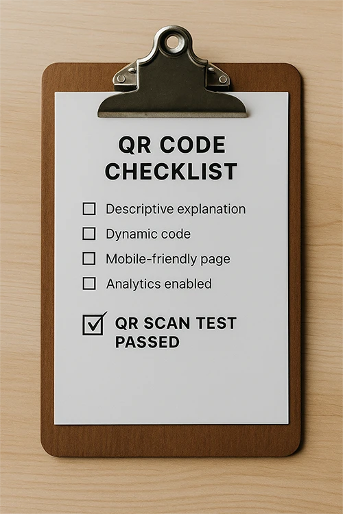
Before sending a layout to print or placing a QR code in a digital channel, review the main points. They cover not only the code itself, but everything that happens before and after the scan:
- ☑ A clear explanation or CTA is added, so people know why to scan
- ☑ A dynamic code is chosen if you need editing, flexibility, or analytics
- ☑ The page is mobile-friendly and opens without errors
- ☑ Analytics are enabled to measure scans and user behavior
- ☑ The QR code design does not hurt scanning, with enough contrast and quiet zone
- ☑ The link uses HTTPS and does not trigger browser warnings
- ☑ The content after the scan matches the promise next to the code
If every point is checked, the risk of technical and communication mistakes is much lower. Then the QR code becomes a deliberate bridge between an offline touchpoint and a digital action, not a random layout element.
Create a QR Code That Is Easy to Scan and Simple to Update
In FbFast, you can create a dynamic QR code with custom design, link editing, analytics, and preview. This helps you avoid guesswork: you can see how the code will look, test it before launch, and change the destination if the campaign or page is updated.
A QR code should not be treated as decoration. It is a communication channel between a person and the next action. It can lead to a request, purchase, menu, instruction, bonus, or useful content. But for that to happen, it must be clear, visible, technically reliable, and honest about what it promises.
Conclusion: A Good QR Code Starts With Attention to Detail
A QR code is a simple tool, but the result depends on many small decisions. Where it is placed, how it is captioned, whether contrast is strong enough, whether the page works, whether HTTPS is used, whether the link can be changed after printing, and whether the page matches the user's expectation. Each of these points affects whether scanning happens and what happens after it.
We have covered the mistakes that appear most often. At first, they may seem minor, but they decide whether a person reaches the page, notices the code, trusts the transition, or completes the intended action. In QR communication, there are no isolated details: design, text, technical quality, and the post-scan page work together.
The good news is that most of these mistakes do not require major resources to fix. They require attention, testing, and a clear understanding of the user scenario. Before printing or launching, walk through the user's path: see the code, understand the call to action, scan, open the page, and complete the action. If there is doubt at any stage, that is where the improvement is needed.
Create QR codes that genuinely work: scan on the first try, lead where they promised, open an up-to-date page, provide analytics, and remain editable. Then the QR code is not just a square in the layout. It becomes a useful touchpoint with your brand.
Every scan should lead to a clear result. That is what separates a random QR code from a thoughtful interaction tool.